
CALGARY -- "Has this winter seemed pretty warm, to you?"
Why, yes, reader. Yes it has.
I'm a meteorologist, sure, however I love me the climatological and statistical aspects. I'll aim to sprinkle a dad-joke or two in there, as some of this content may get a little dry. The military thing to do is the BLUF — or bottom line up front, so here goes:
Calgary regularly experiences above-average temperatures, but those averages are dragged down by much cooler periods throughout the season.
Lower mean temperatures — due to limited daylight — also contribute but are frequently counteracted by westerly wind and warmer ridges.
Introduction
The scope of this study is the past 20 meteorological winters, which is Dec. 1 to the end of February.
The meteorological months are divided evenly with the Julian calendar (that Caesar guy still has influence, and pretty okay pizza).
The Astronomical seasons coincide with the position of the sun relative to the equator.
What constitutes a warm or 'warmer-than-normal' winter is completely relative but for the sake of simplicity, I'm looking at temperature bases above freezing, with a spare column for those who consider it 5 C or warmer, and another outlook on days that drop off below -10 C.
What are our seasonal averages?
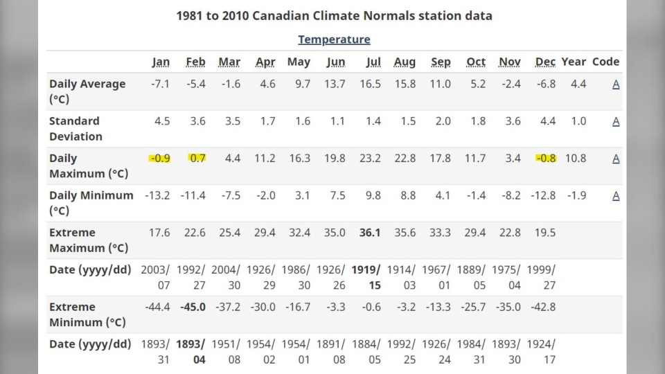
Seasonal normal high temperatures are actually below 0 C through most of meteorological winter. Varying sources will keep seasonal high averages from -1 C to -3 C through December and January, with Environment Canada's station data shown below:
From that perspective, it makes some degree (pun intended) of sense that we see a fair deal of days above 0 C. When it feels more like March or November in the middle of meteorological winter for stretches of time, we can obtain a recency bias that makes us believe it's a lot warmer than it is, while the fact remains — this is largely on-brand for a Calgary winter.
One pre-graph(s) stat
In the past 20* years, 974 of our 1739 winter days have gotten above 0 C. That's 56 per cent.
If I left the article there, it'd be really, REALLY lacking. We must go deeper.
*I'm not including 2013 due to gaps in data.
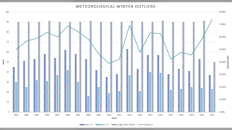
I included the length of meteorological winter on the graph to account for both leap years, and our in-progress 2021.
This is only focusing on the "warm" data. I've used that word loosely, here, but the big takeaway can be found on the right-side y-axis: check out how high those percentages go. So far, this meteorological winter, we're up to 71 per cent of our days above seasonal. If my five-day forecast holds out, that jumps to 74 per cent.
It's toasty so far but the polar vortex is around the corner (later this month), and we can expect this chart to normalize, somewhat.
Let's move on to the "cold" chart.
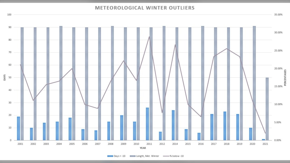
Notice again that right-side axis, and the difference in numerical range. Much, much tinier. This speaks to the relative infrequency of days below -10 C over the course of most winters.
Next, for the nostalgic, let's tackle the outlying years:
Days greater than 0 C:
38.9 per cent in 2010 represents the lowest (35 of 90) number of days above zero.
71 per cent this year represents the highest percentage so far, edging out 69.66% from 2006 (62 of 90).
Days greater than 5 C:
2008 had the least, at 16 (17.6 per cent), and 2006 takes the win (so far) at 46.7 per cent of days above 5 C. If we get there today, 2021 takes the title … but then we'll lose it again as we cool off closer to the weekend. I knew I shouldn't have counted 2021.
Days cooler than -10 C:
In 2011, 26 days were frostier than -10. That's just shy of 29 per cent of days in meteorological winter, while in 2007, just 8 days fell below that marker.
Lastly for graphs, let's take all of that data and smash it together.
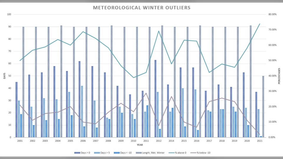
There's nothing new here from the other two; this is for comparison's sake between those percentages of days that reach above 0 C and beneath -10 C.
Is there a relationship here?
Yes, and a strong one: I used the relationship between the frequency of "Days above 0" and "Days below -10 C": -0.824.
Correlation coefficients are values between 1 (positive correlation) and -1 (negative correlation); the closer they are to those whole numbers, the more they share a commonality. In this case, a -0.824 means there is a strong negative relationship between these values; that is to say, when one edge of the relationship hits with a high frequency, the other side plays "opposite day" and stays away.
For winters with many days in the positives, there are fewer days beneath -10 C, and vice versa.
I also attempted to look at ENSO (El Nino, La Nina) relationships, along with the Arctic Oscillation's relationships, to see if this could be tracked in a deeper manner, but there were no relationships strong enough to merit mention here.
So, is it warmer than we might think here?
If the answer were easy, you wouldn't have had to scroll when you clicked the link.
Calgary's shortest day is just seven hours, 54 minutes (and 19 seconds), which means we're looking at a hair over 16 hours of darkness. Unless we have a mild west wind billowing along at all hours, we're losing our already-limited energy for the majority of our time. That creates lower mean temperatures. Note the second column from Calgary.weatherstats.ca:
You can almost attribute the cause of our lower-than-you-might-expect average temperatures to this element; we don't have an abundant influx of solar energy.
Wrap it up, Kevin
Fine. Our periods of extreme cold during Arctic outbreaks (or polar vortices, which are less common) pack enough punch to drop seasonal averages, and Calgary will always be susceptible to that. However, our high temperatures has lingered in a positive majority over the last twenty years.
Our perceptions of winter might need to adjust – they really aren't all that chilly in Calgary (until they are – check back in a couple of weeks).


